




The Ultimate Free Brand Presentation Template Blueprint

5 minutes read
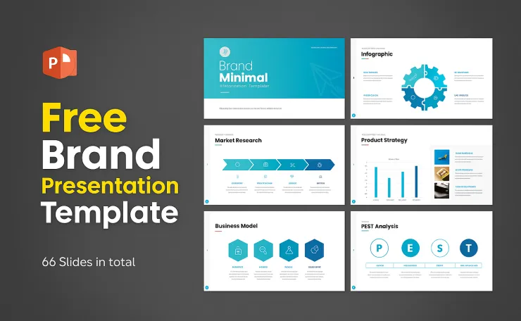
If your slides look “pretty” but don’t move people to act, they’re decoration. Let’s fix that. In this guide, we’ll build a brand presentation template that’s clean, minimalist, and built to convert—tailored for the US, UK, and EU marketplaces. You’ll get a structure, design rules, and a checklist you can use today.
Why a Brand Presentation Template Beats One-Off Decks
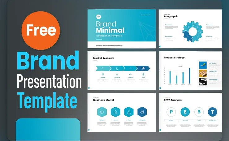
Most teams rebuild slides from scratch, then wonder why the message changes every meeting. A reusable branding deck template gives you:
- Consistency: Every deck looks on-brand—fonts, color, spacing, voice.
- Speed: You plug content into master layouts. No reinventing.
- Clarity: Minimal design + strong hierarchy = ideas land faster.
- Scale: Works for pitches, onboarding, case studies, and training.
Free Download
The 9-Slide Core (Use This as Your Default)
Keep the story tight. Start with these slides, then add only what’s necessary:
- Cover – Brand, tagline, one-liner value prop.
- Problem → Insight – What’s broken? What do you know that others miss?
- Positioning – Category + promise + proof in one frame.
- Identity – Logo, color palette, typography, iconography (with do/don’t).
- Voice & Tone – Messaging pillars, example lines, banned phrases.
- Visual System – Layout grid, spacing, image style, safe areas.
- Content System – Social/post frames, ad layouts, story templates.
- Proof – Case study with numbers: Before → After → Result.
- CTA – Next step: schedule a call, request a proposal, or download.
Rule: 9–15 slides max. If you need deep rules, split a Brand Manual (rules) from a Brand Deck (story + proof).
Design Principles: Minimal, Not Boring
Make “clean” mean “convertible,” not “empty.” Use these non-negotiables:
1) Visual Hierarchy (One idea per slide)
- Limit to 3 font sizes (e.g., H1 36–40px, H2 24–28px, body 16–18px).
- Use spacing to stage content: headline → subline → bullets.
- Skimmable first, then scannable details.
Deep dive: The Nielsen Norman Group on readability and hierarchy: https://www.nngroup.com/
2) Contrast That Passes Anywhere (US/UK/EU)
Free Download
- Aim for 4.5:1 contrast for body text.
- Test on light and dark backgrounds—the deck should survive bad projectors.
Standard: W3C WCAG contrast basics: https://www.w3.org/TR/WCAG21/#contrast-minimum
3) Type Pairing (Reliable + Flexible)
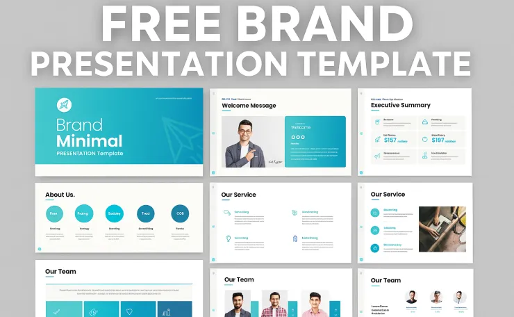
- Primary sans (Inter, Barlow, Poppins) + optional accent.
- Stick to Regular/Medium/Bold. No circus of weights.
- Avoid all caps paragraphs (hurts readability).
Resource: Google Fonts library: https://fonts.google.com/
4) Grid & Spacing (No Freelancing)
- Use an 8-point grid (8/16/24/32).
- Lock your master margins. If it doesn’t align, it doesn’t ship.
Build Once, Use Forever (PowerPoint, Google Slides, Keynote)
PowerPoint (PPTX)
- Set fonts, colors, and layouts in the Slide Master.
- Create core masters: Title, Title+Content, Two-Column, Feature, Case Study, CTA.
- Save brand palette as theme colors for one-click recolors.
Help: https://support.microsoft.com/powerpoint
Google Slides
- Use Theme Builder to prevent “layout drift.”
- Lock background elements; keep content in placeholders.
- Share a “View Only” master and duplicate for each new deck.
Help: https://support.google.com/docs/topic/9055121
Keynote/Canva
- Create Master Slides (Keynote) or Custom Pages (Canva).
- Store brand components (logos, icons, mockups) in one assets slide.
Regional Notes: US vs UK vs EU (Small Tweaks, Big Wins)
- US: Use US spelling (color, customize). Straight-to-the-point copy.
- UK: Use UK spelling (colour, customise, organisation). Tone slightly more formal.
- EU: Keep English master, then localise key slides for DE/FR/ES/IT/NL. Add hreflang tags on your landing page and translate alt text for images.
Bonus: When you export a PDF, ensure the file name includes your focus keyword and region, e.g., brand-presentation-template-uk.pdf.
Slide Kit You Can Copy (Minimal, High-Impact)

- Section Divider – Big title (e.g., “IDENTITY”), micro-subtitle.
- Feature Callout – One mockup, three bullets, short kicker.
- Before/After – Two-up columns with metric callout (+34% CTR).
- Quote Slide – Client photo, role, one sentence.
- Pricing/Packages (optional) – Three columns, highlight the middle.
- CTA – One action. Add QR or short URL.
This naturally reinforces LSI like: branding deck template, brand manual presentation template, modern minimalist presentation template, clean presentation template free.
Free Download
Content That Sells (Not Just “Looks Nice”)
Hook with stakes: “Most decks confuse buyers. Yours will convert them.”
Prove with numbers: case study or pilot results.
Guide with structure: headers, bullets, and examples.
Close with clarity: one CTA, one next step.
Micro-copy you can steal:
- “This is the brand playbook your sales team actually uses.”
- “Less decorating. More deciding.”
- “One deck. One look. Zero confusion.”
Asset System: Colors, Icons, Mockups
- Colors: Primary, Secondary, Accent, Surface, Text (light/dark).
- Icons: Consistent stroke (1–1.5px), both line + solid versions.
- Mockups: Desktop, mobile, social post, ad frame.
- Ratios: Keep 16:9 Full HD (1920×1080); export web-friendly PDFs.
Tip: If you include a “5000+ icons pack,” store a curated Top 40 slide so teammates don’t go treasure hunting mid-deadline.
Free Business Plan PowerPoint Template Download: Win Your Next Pitch
External Resources (Credible, Useful)
- Readability & hierarchy: Nielsen Norman Group – https://www.nngroup.com/
- Contrast standards: W3C WCAG 2.1 – https://www.w3.org/TR/WCAG21/#contrast-minimum
- Fonts: Google Fonts – https://fonts.google.com/
- Editors help: Microsoft PowerPoint – https://support.microsoft.com/powerpoint
- Editors help: Google Slides – https://support.google.com/docs/
Final Takeaway (CTA)
Your deck isn’t a slideshow—it’s your brand system on one page. Build the 9-slide core, lock your masters, and keep the design minimal so your message does the heavy lifting.
Free Download
Want a head start? Download the free Brand Presentation Template Checklist and use it as a template in PowerPoint or Google Slides. Then ship your next deck in under an hour.


2 Comments